Note
Go to the end to download the full example code.
Bars#
from __future__ import annotations

from numpy import array

from gemseo.datasets.dataset import Dataset
from gemseo.post.dataset.bars import BarPlot
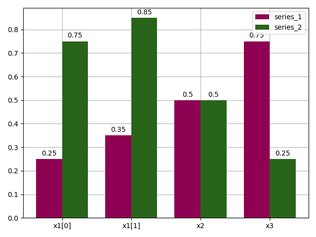
Build a dataset#
Let us consider two series of values for the variables x1, x2 and x3
which we arrange in rows in a Dataset:
dataset = Dataset()
dataset.add_variable("x1", array([[0.25, 0.35], [0.75, 0.85]]))
dataset.add_variable("x2", array([[0.5], [0.5]]))
dataset.add_variable("x3", array([[0.75], [0.25]]))
dataset.index = ["series_1", "series_2"]
dataset
Plot the two series on a bar chart#
We can use the BarPlot to display these series,
with one color per series and the values grouped by variable name:
plot = BarPlot(dataset, n_digits=2)
plot.colormap = "PiYG"
plot.execute(save=False, show=True)
[<Figure size 640x480 with 1 Axes>]
Tip
BarPlot can use plotly to generate an interactive web-based figure.
Just set the execution option file_format to "html".
Total running time of the script: (0 minutes 0.088 seconds)