Note
Go to the end to download the full example code
Iris dataset
Presentation
This is one of the best known dataset to be found in the machine learning literature.
It was introduced by the statistician Ronald Fisher in his 1936 paper “The use of multiple measurements in taxonomic problems”, Annals of Eugenics. 7 (2): 179-188.
It contains 150 instances of iris plants:
50 Iris Setosa,
50 Iris Versicolour,
50 Iris Virginica.
Each instance is characterized by:
its sepal length in cm,
its sepal width in cm,
its petal length in cm,
its petal width in cm.
This dataset can be used for either clustering purposes or classification ones.
from __future__ import annotations

from numpy.random import default_rng

from gemseo import configure_logger
from gemseo import create_benchmark_dataset
from gemseo.post.dataset.andrews_curves import AndrewsCurves
from gemseo.post.dataset.parallel_coordinates import ParallelCoordinates
from gemseo.post.dataset.radviz import Radar
from gemseo.post.dataset.scatter_plot_matrix import ScatterMatrix

configure_logger()

rng = default_rng(1)
Load Iris dataset
We can easily load this dataset
by means of the high-level function create_benchmark_dataset():
iris = create_benchmark_dataset("IrisDataset")
and get some information about it
iris
Manipulate the dataset
We randomly select 10 samples to display.
samples = rng.choice(len(iris), size=10, replace=False)
We can easily access the 10 samples previously selected, either globally
data = iris.get_view(indices=samples)
or only the parameters:
iris.get_view(group_names=iris.PARAMETER_GROUP, indices=samples)
or only the labels:
iris.get_view(group_names="labels", indices=samples)
Plot the dataset
Lastly, we can plot the dataset in various ways. We will note that the samples are colored according to their labels.
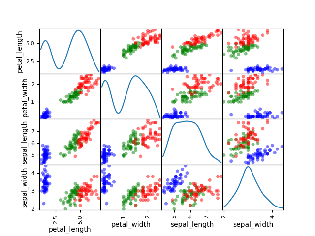
Plot scatter matrix
We can use the ScatterMatrix plot where each non-diagonal block
represents the samples according to the x- and y- coordinates names
while the diagonal ones approximate the probability distributions of the
variables, using either an histogram or a kernel-density estimator.
ScatterMatrix(iris, classifier="specy", kde=True).execute(save=False, show=True)
[<Figure size 640x480 with 16 Axes>]
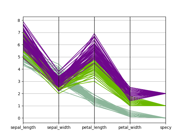
Plot parallel coordinates
We can use the
ParallelCoordinates plot,
a.k.a. cowebplot, where each samples
is represented by a continuous straight line in pieces whose nodes are
indexed by the variables names and measure the variables values.
ParallelCoordinates(iris, "specy").execute(save=False, show=True)
[<Figure size 640x480 with 1 Axes>]
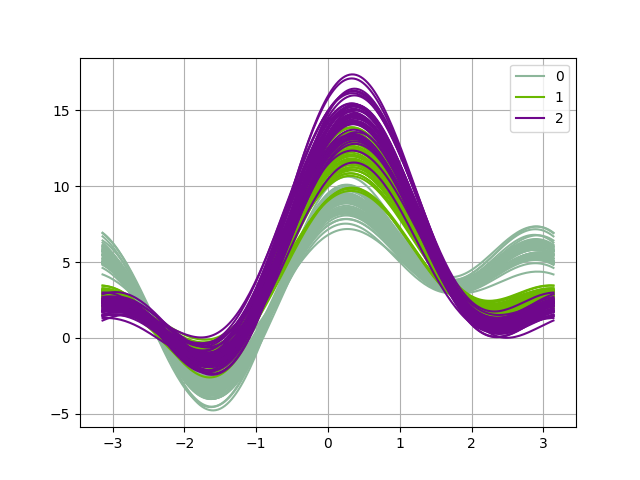
Plot Andrews curves
We can use the AndrewsCurves plot
which can be viewed as a smooth
version of the parallel coordinates. Each sample is represented by a curve
and if there is structure in data, it may be visible in the plot.
AndrewsCurves(iris, "specy").execute(save=False, show=True)
[<Figure size 640x480 with 1 Axes>]
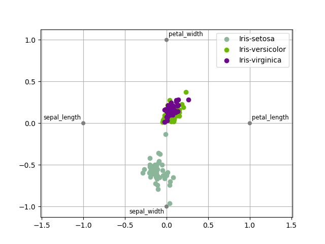
Plot Radar
We can use the Radar plot
Radar(iris, "specy").execute(save=False, show=True)
/home/docs/checkouts/readthedocs.org/user_builds/gemseo/envs/develop/lib/python3.9/site-packages/gemseo/datasets/dataset.py:416: FutureWarning: Setting an item of incompatible dtype is deprecated and will raise in a future error of pandas. Value '['Iris-setosa' 'Iris-setosa' 'Iris-setosa' 'Iris-setosa' 'Iris-setosa'
 'Iris-setosa' 'Iris-setosa' 'Iris-setosa' 'Iris-setosa' 'Iris-setosa'
 'Iris-setosa' 'Iris-setosa' 'Iris-setosa' 'Iris-setosa' 'Iris-setosa'
 'Iris-setosa' 'Iris-setosa' 'Iris-setosa' 'Iris-setosa' 'Iris-setosa'
 'Iris-setosa' 'Iris-setosa' 'Iris-setosa' 'Iris-setosa' 'Iris-setosa'
 'Iris-setosa' 'Iris-setosa' 'Iris-setosa' 'Iris-setosa' 'Iris-setosa'
 'Iris-setosa' 'Iris-setosa' 'Iris-setosa' 'Iris-setosa' 'Iris-setosa'
 'Iris-setosa' 'Iris-setosa' 'Iris-setosa' 'Iris-setosa' 'Iris-setosa'
 'Iris-setosa' 'Iris-setosa' 'Iris-setosa' 'Iris-setosa' 'Iris-setosa'
 'Iris-setosa' 'Iris-setosa' 'Iris-setosa' 'Iris-setosa' 'Iris-setosa'
 'Iris-versicolor' 'Iris-versicolor' 'Iris-versicolor' 'Iris-versicolor'
 'Iris-versicolor' 'Iris-versicolor' 'Iris-versicolor' 'Iris-versicolor'
 'Iris-versicolor' 'Iris-versicolor' 'Iris-versicolor' 'Iris-versicolor'
 'Iris-versicolor' 'Iris-versicolor' 'Iris-versicolor' 'Iris-versicolor'
 'Iris-versicolor' 'Iris-versicolor' 'Iris-versicolor' 'Iris-versicolor'
 'Iris-versicolor' 'Iris-versicolor' 'Iris-versicolor' 'Iris-versicolor'
 'Iris-versicolor' 'Iris-versicolor' 'Iris-versicolor' 'Iris-versicolor'
 'Iris-versicolor' 'Iris-versicolor' 'Iris-versicolor' 'Iris-versicolor'
 'Iris-versicolor' 'Iris-versicolor' 'Iris-versicolor' 'Iris-versicolor'
 'Iris-versicolor' 'Iris-versicolor' 'Iris-versicolor' 'Iris-versicolor'
 'Iris-versicolor' 'Iris-versicolor' 'Iris-versicolor' 'Iris-versicolor'
 'Iris-versicolor' 'Iris-versicolor' 'Iris-versicolor' 'Iris-versicolor'
 'Iris-versicolor' 'Iris-versicolor' 'Iris-virginica' 'Iris-virginica'
 'Iris-virginica' 'Iris-virginica' 'Iris-virginica' 'Iris-virginica'
 'Iris-virginica' 'Iris-virginica' 'Iris-virginica' 'Iris-virginica'
 'Iris-virginica' 'Iris-virginica' 'Iris-virginica' 'Iris-virginica'
 'Iris-virginica' 'Iris-virginica' 'Iris-virginica' 'Iris-virginica'
 'Iris-virginica' 'Iris-virginica' 'Iris-virginica' 'Iris-virginica'
 'Iris-virginica' 'Iris-virginica' 'Iris-virginica' 'Iris-virginica'
 'Iris-virginica' 'Iris-virginica' 'Iris-virginica' 'Iris-virginica'
 'Iris-virginica' 'Iris-virginica' 'Iris-virginica' 'Iris-virginica'
 'Iris-virginica' 'Iris-virginica' 'Iris-virginica' 'Iris-virginica'
 'Iris-virginica' 'Iris-virginica' 'Iris-virginica' 'Iris-virginica'
 'Iris-virginica' 'Iris-virginica' 'Iris-virginica' 'Iris-virginica'
 'Iris-virginica' 'Iris-virginica' 'Iris-virginica' 'Iris-virginica']' has dtype incompatible with int64, please explicitly cast to a compatible dtype first.
  self.loc[

[<Figure size 640x480 with 1 Axes>]
Total running time of the script: (0 minutes 1.353 seconds)